Project Overview
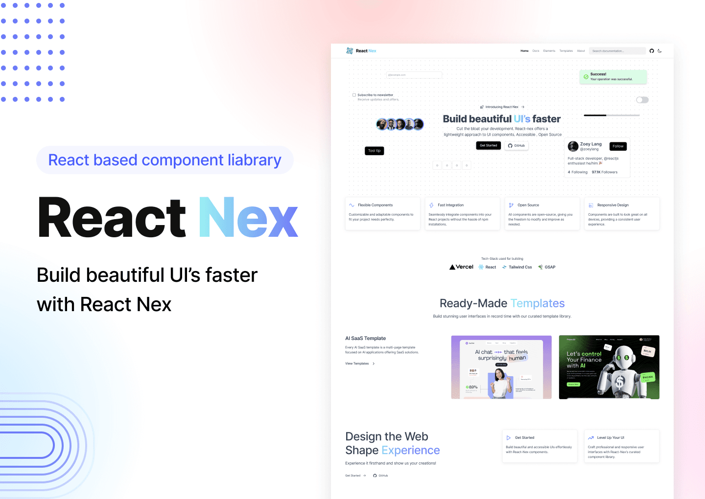
React Nex is an open-source, developer-friendly UI component library designed to accelerate front-end development in React.
The project includes ready-made, accessible, and customizable components, along with responsive templates; all created with modern design standards and developer needs in mind.
Problem Statement
Developers often spend valuable time recreating the same basic UI components for every new project.
Many existing libraries are either too complex or not visually polished.
Our goal was to design a clean, consistent, and easily usable component system with a great developer experience.
Objectives
Design a complete, modern UI library for React
Focus on consistency, accessibility, and dark mode support
Include real-world templates to demonstrate usability
Enhance UI with subtle animations for better interaction
Design Process
Research & Inspiration
I analyzed popular UI libraries like ShadCN, Tailwind UI, and Radix UI. The goal was to understand
Commonly used components
Developer pain points
Best practices in accessibility and modular design
I also gathered feedback from front-end developers to ensure the design direction aligned with their workflow.
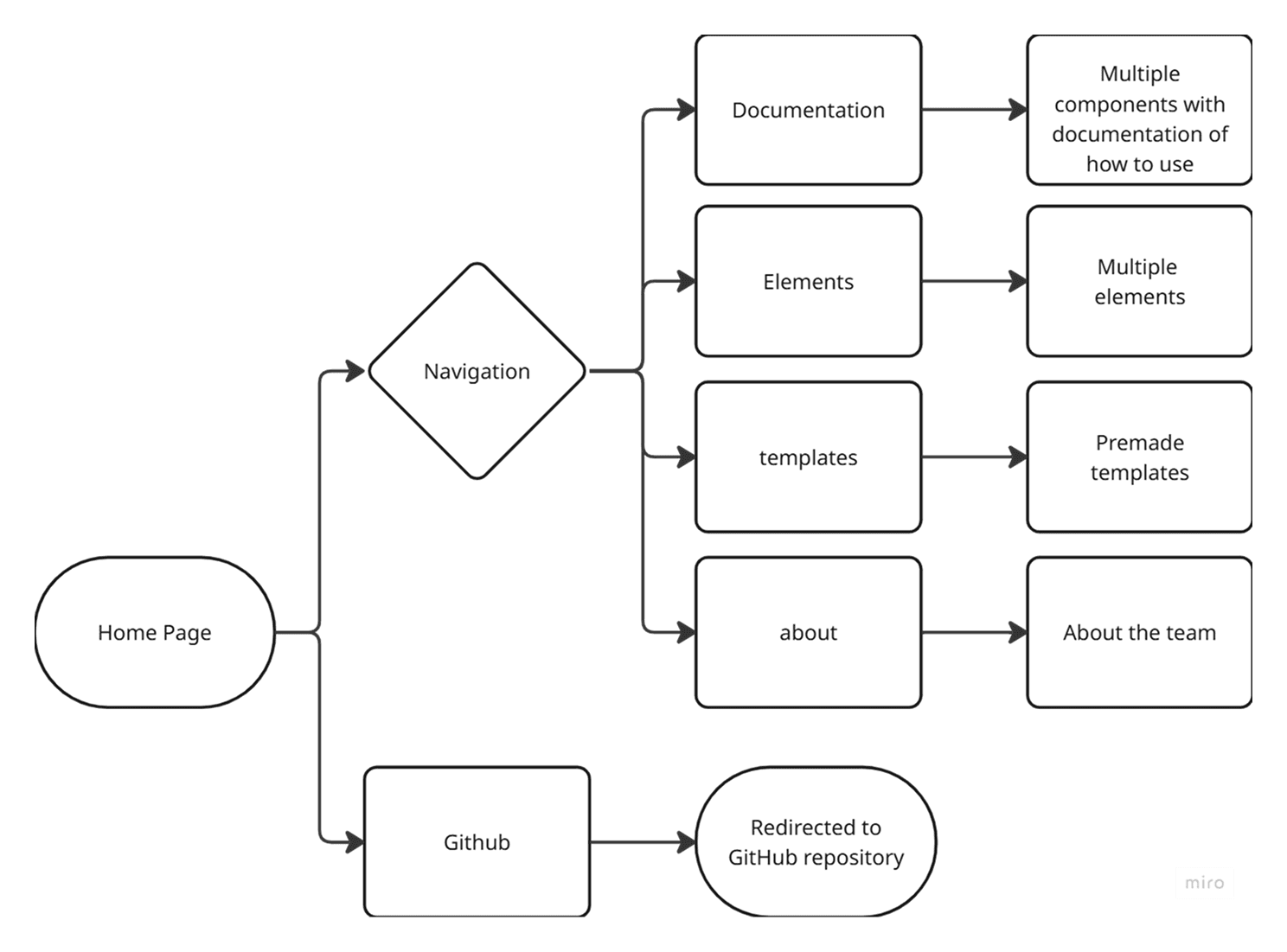
User Flow & Wireframing
Before designing, I mapped out the user flow to understand how developers would navigate the library; from landing on the homepage to exploring components and using templates. This helped ensure the experience was intuitive, especially for first-time users.
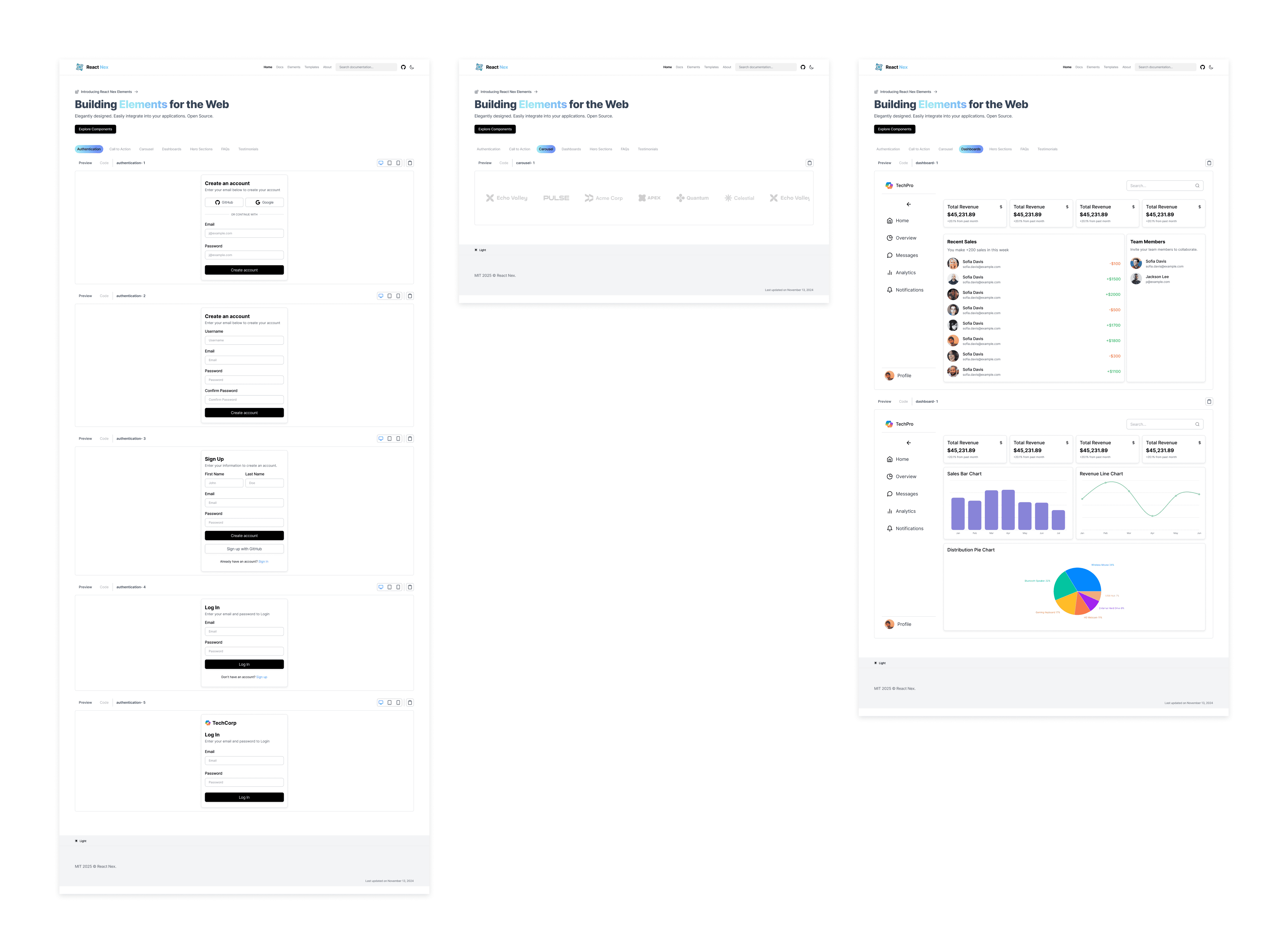
Components
Designed a system of scalable, reusable components:
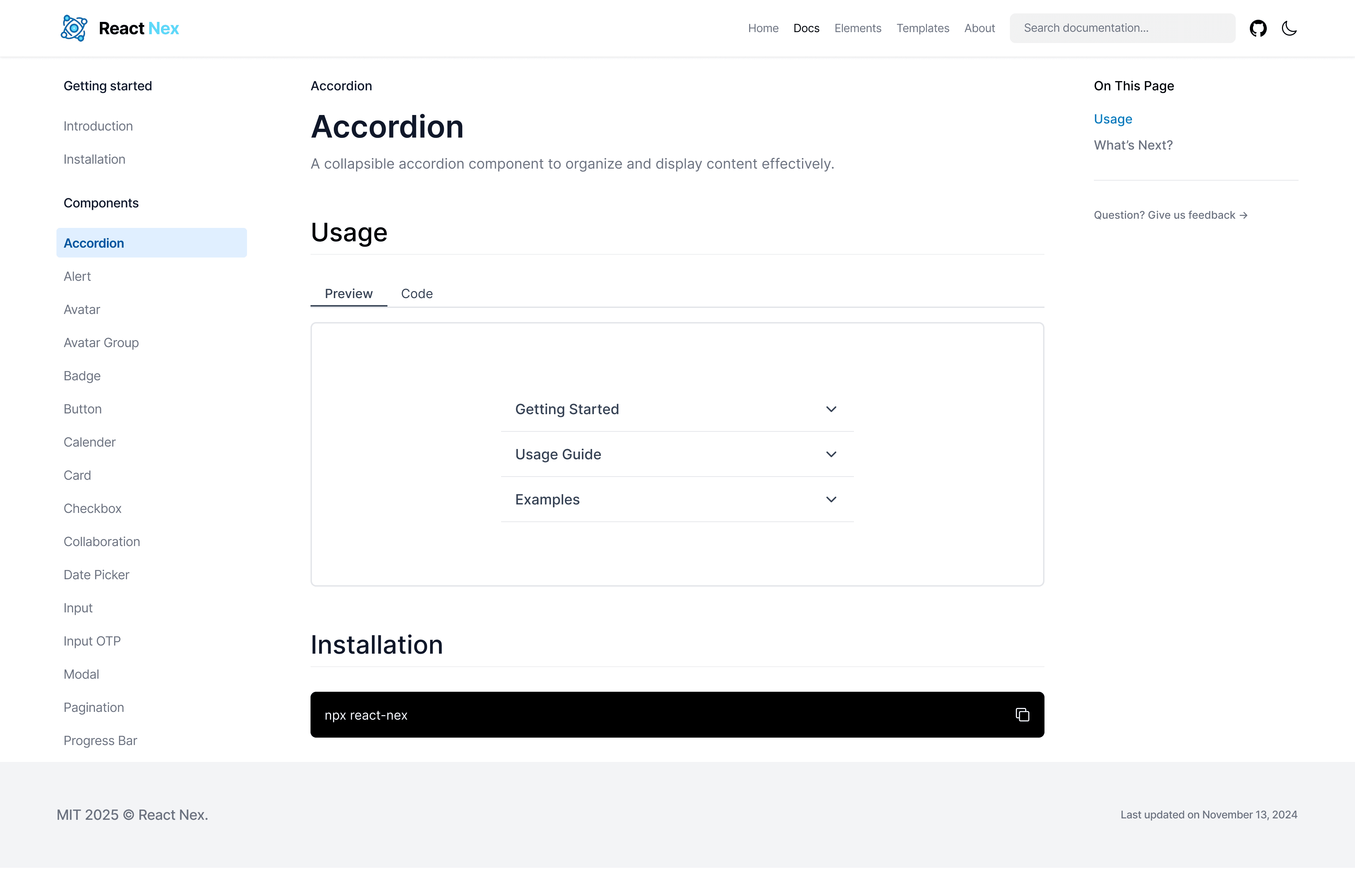
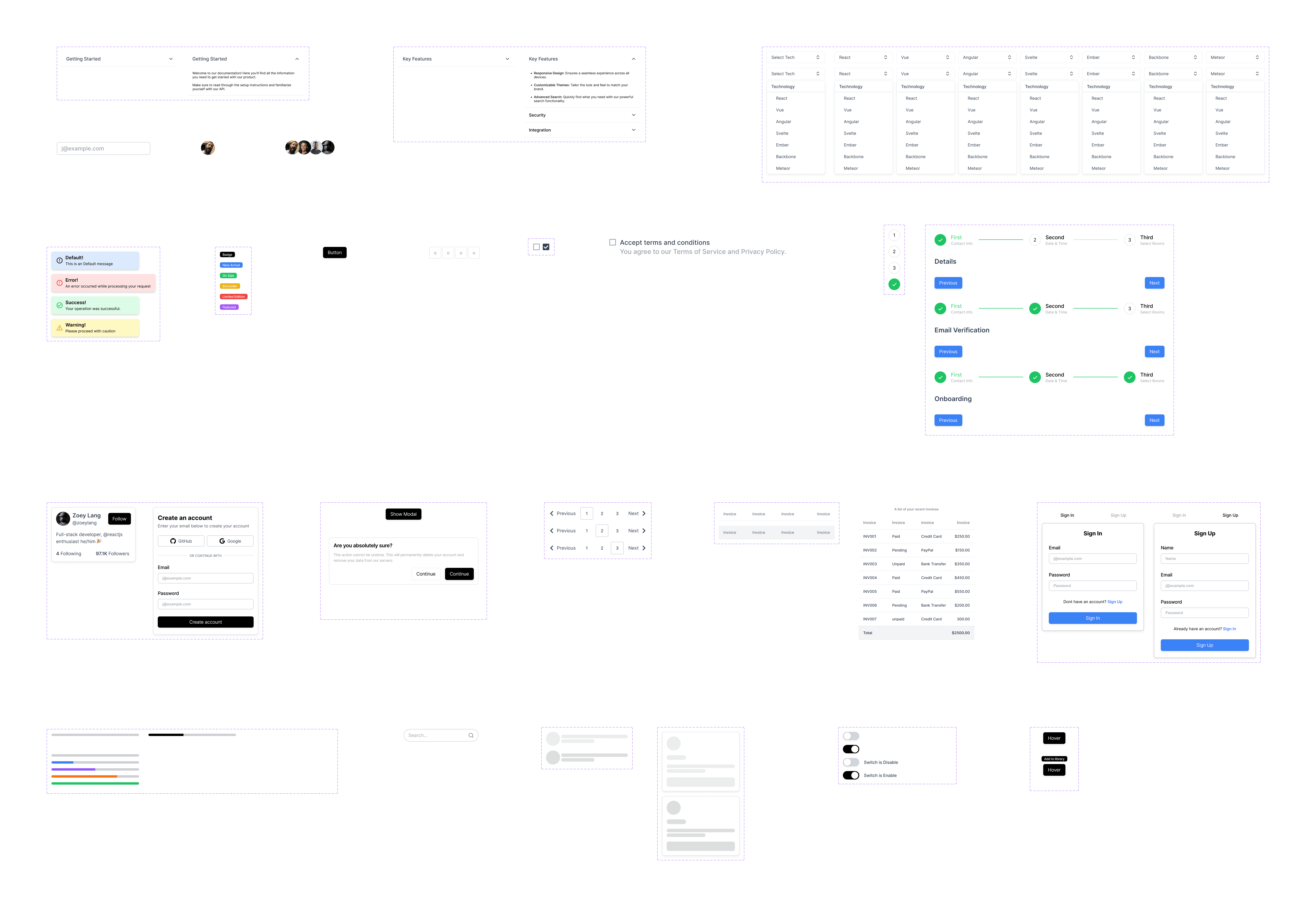
Elements
Using the base components, I designed practical UI elements like:
Login Forms
Carousels
Dashboards
FAQ Sections
Each of these elements was built using the components I designed, ensuring consistency across the platform
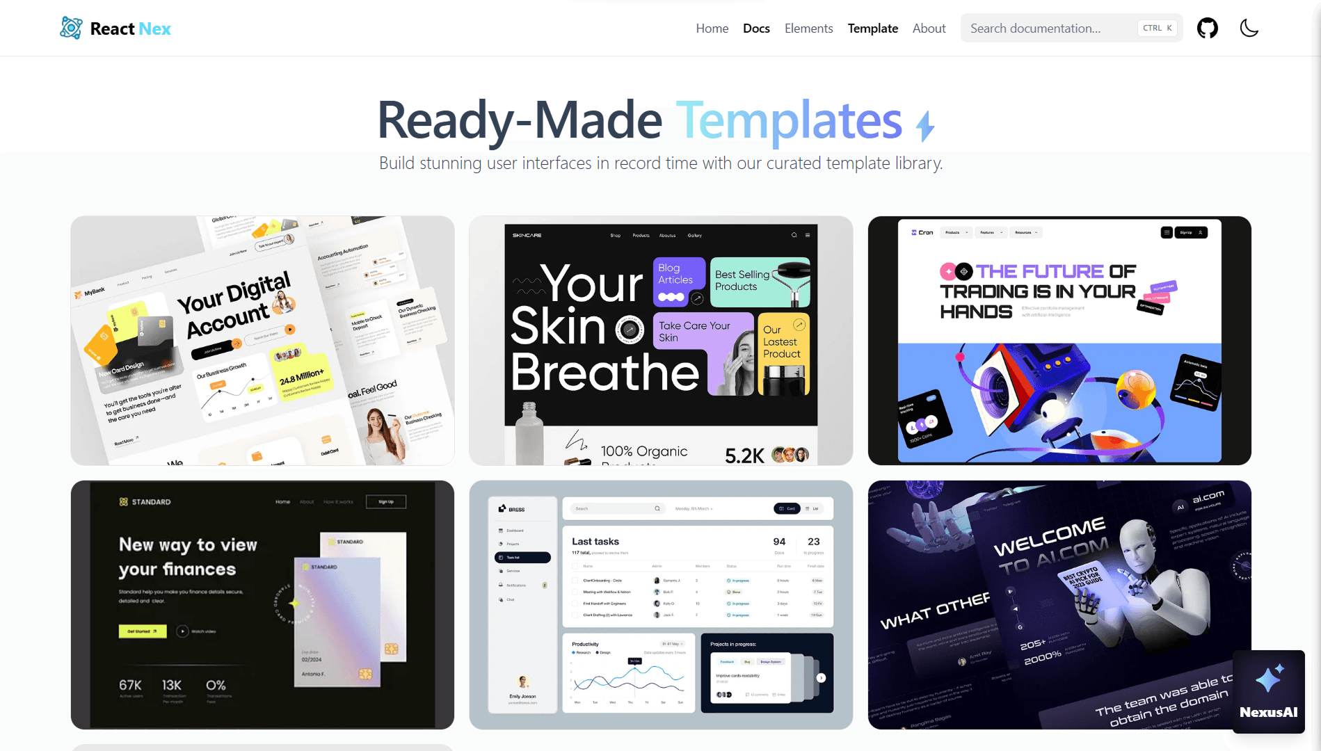
Templates
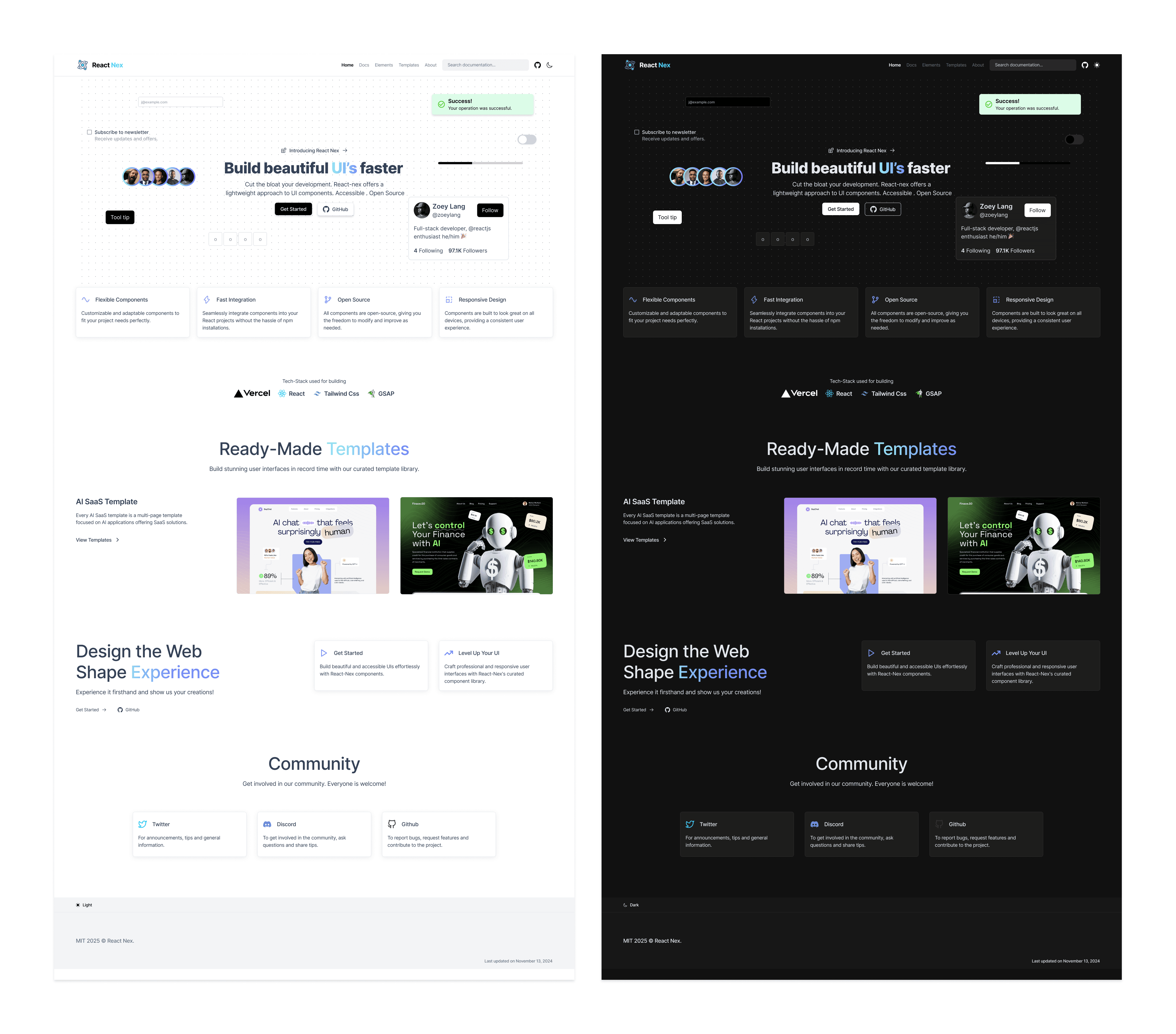
I designed ready-to-use templates, including a full SaaS landing page to demonstrate how the components could be combined in real-world applications.
This made it easy for developers to see how to integrate the design system into their projects.
Overall Website Design
Typography: Clean sans-serif for readability and modern feel
Color Palette: Neutral tones with customizable accent colors
Spacing & Grids: Tailwind-style consistent spacing
Accessibility: High contrast, focus states, and keyboard-friendly navigation
Dark Mode: Built-in toggle with full component support
Key Features
25+ reusable components with clean design
Fully responsive and accessible
Built-in dark mode
Real-world templates like SaaS landing page
Developer-friendly documentation and previews
Subtle animations with GSAP for better UX
Challenges
Balancing simplicity for developers with a polished UI
Designing components that are both flexible and consistent
Ensuring full responsiveness and accessibility across all devices
Integrating smooth animations without affecting performance
Conclusion
Designing React Nex gave me hands-on experience in building a complete design system from scratch. It pushed me to think both as a designer and as a developer — focusing on scalability, usability, and real-world application.
This project helped me
Strengthen my component-based design approach.
Understand developer pain points and preferences.
Improve my skills in responsive design and accessibility.